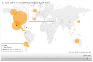
As cases of the, now pandemic, swine flu breach 1,000 in the UK, the BBC has run a great dynamic infographic to show the spread of cases globally.

The animation is run using the slider along the bottom, showing both the increase in cases of the flu and the related deaths – in the light and dark circles respectively. Thankfully at this time the death figures are still low, and we can only hope that the preparedness plans in place around the world will keep it that way, but still the BBC graphic is a wonderfully simple yet effective illustration.