Filed under: Interaction Design, Product Management | Tags: product, ratings, recommendations, reviews, trust | Comments Off on Please Rate This
The other day I met the founder of a rapidly growing startup for lunch. The first thing we talked about though wasn’t strictly business, it was about where we had met to eat. The venue was a popular restaurant in the centre of London that had been chosen by someone else as part of organising his busy day in London. Both of us were unsure we wanted to eat there, as London has an amazing selection of high quality restaurants and this was in both our opinions not one of them, but since he had to catch a flight we decided to stick with the plan to make the most of our time.
Spoiler alert: the food was solid and neither of us got food poisoning, so this is not an early Halloween food horror story.
The restaurant chosen is actually very highly rated on TripAdvisor, in the top 150 of the near 19,000 London restaurants they have on their site. This seems like a good reason to choose it, at least on the face of it you’re not going to go far wrong eating there. That doesn’t mean that it’s a restaurant that everyone will enjoy in the same way. In my experience of using TripAdvisor there will be the obvious bias towards tourists given their target market, and within that a strong American focus depending on the city. This leads to a natural skew in what types of restaurants are preferred, which hotels are favoured and so on. Personally I do use TripAdvisor regularly when I travel, but tend to use bad ratings as an exclusion criteria, then the reviews as a positive decision input. The upshot is – if you want a more interesting local restaurant recommendation you may need to dig around for a more local site. Or ask that obsessive foodie friend you have as they are guaranteed to have a list of amazing places to go around the world (thanks Engin).
Of course on every site and service we use these days we have ratings. That AirBnB you want to book? That Amazon purchase you want to make? That Uber you just took? Over 1,000 people rated it an average of five stars, go for it! We generally believe people expect a rating, it gives potential customers a sense that other people have been there and trodden this path before us giving a sense of security. The rating itself may not even be as important as the number of people who’ve given it – 4.5 / 5 stars seems good, but less so if only a few people have rated it.
Ratings are not the only mechanism – there are also likes, or “would you recommend this product to a friend?” questions with a yes / no answer. Simple, binary and blunt. Personally I prefer that approach, as it is quick, emotional and talks strongly to the concept that we only recommend something based on our own experiences. “I thought that was the best food I’d ever had”, oh – did I mention I’m a strict vegan?
Which comes to the crux of the problem – does that rating or recommendation that someone else gave apply to the person currently using it to make their own decision. When your company is small with few users this is often not a problem, you attract a focussed group of early adopters with likely similar needs, but as you grow the problem changes. That’s why it’s fundamentally important to constantly review core behaviours in your product even if they’ve seemed to work for a long time – people change, even if your product doesn’t and what was acceptable to them even last year may not be now. At some point moving to a ‘people like you, liked this’ approach looks to have the most merit. It leads to different challenges, how do you know which people are like each other? How do you deal with anonymous users?
Netflix has gone for this different approach, they offer a match percentage based on what you’ve watched before. After you watch a show or series you can give it a thumbs up or down, and as you watch more – in theory – the match and recommendations for you get better and better. This allows them to push recommendations across their huge content library and keep you binging on more shows, a core KPI. Their recommendation approach has taken a long time to develop and is not cheap to run, they have around 1,000 people working on their recommendations that get updated every 24 hours. Understanding what content works best for everyone on their system is a core differentiator to their business model so this investment makes total sense.
Every approach has its own merits, and the approach you take will need to vary over time. Likely the only truth is that if you use no rating mechanism at all you are missing out on a wealth of value both for you and your users. In every market there are subtleties, and as product people we have to understand both the different dynamic of our product offering, and also the expected normal behaviours of our target market. Even a small mis-match that sends a customer to a choice they don’t ultimately enjoy can damage their trust in us, and trust is the most valuable commodity.
Filed under: Interaction Design | Comments Off on Inspiration – Eames at the Barbican

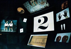
Detail of Ovid theatre – from Domus Magazine
The powerhouse of design that was Charles and Ray Eames is currently undergoing a major show at the Barbican in London. Their work spanned many design disciplines but always with one focus – this was something a person used and got value from – so as a product manager, and design geek, this is a must see show.
“The details are not the details. They make the design.”
Most of my experience of Eames’ work comes from the furniture that pervades many design shows, combined with watching the excellent documentary – Eames: the Architect and the Painter. The documentary is a great introduction especially as the show groups together physical products from almost every aspect of their life – and the Eames were all about physical production, even with their films.
“Take your pleasure seriously”
The show covers not only these physical artefacts, but also shows how they made many of them. My first strong memory of Eames came from watching the Powers of Ten film. The way in which they conveyed what happens at different orders of magnitude, both beautiful and informative, stayed with me from that day – even while my physics background questioned some of the simple models they showed at small scales. In this show you get to see not only that film in full, but also see some of the real production work that went into it. This was a time before computers, so every frame was painstakingly cut out, stuck together and then filmed to create this simple sub-ten minute epic.
As well as the films you also see models of the house they lived in and the choices they made to create it. Space for entertaining and socialising was key, as well as beautiful lines and flow. The Eames held regular dinner parties, encouraging sharing of ideas and creativity, and their home was at the centre of this. Their design ethic permeated every part of their lives.
“Beyond the age of information, there is the age of choices.”
One of my favourite parts of the show is a recreation of the ovoid theatre from the World’s fair. In this structure, shown at the top of the post, the Eames had a number of screens arranged in a dynamic layout. Each screen showed different images – either parts of the same image (in a time before 72 inch LCD was common) or related films that they carefully choreographed so that interactions occurred across different screens – such as a cheque passing from a customer to a salesperson across the divide. Nowadays this type of visual play is common, but in those days this was highly innovative. As a topic, they took the idea of how we research and plan – comparing the relatively simple task of a seating plan for a dinner party to high powered scientific considerations – and showing that the core steps were the same, in creating an internal mental model that you manipulate then try out in the real world. All of this, if somewhat dated in presentation, feels relevant now and still engages you to watch.
Overall from the show you get a sense of the work this talented wife and husband couple did in taking complex challenges and solving them in ways that seem simple to the person using them. This resonates with our modern world of information overload and seemingly endless choices, all as good as each other. Eames himself saw this coming, in the quote above he cites this ‘age of choices’ as the follow on to the information age – personally I’d always hoped it was an ‘age of knowledge’ but that does seems an age or two away right now. As a product person, understanding how to simplify these choices – without removing the necessary detail – is one of the most interesting challenges we face every day. Less is more, something Ray and Charles Eames understood and executed perfectly time after time.
The World of Charles and Ray Eames is on at the Barbican until 14th February 2016.
Filed under: Graphic Design, Inspiration, Interaction Design | Tags: Art, Design Inspiration | Comments Off on Inspiration – Paul Klee at The Tate Modern
I love the Tate Modern. It’s handy for where I live and work, the annual membership is very reasonable and the members cafe at the top has great views with a decent cappuccino (though perhaps not enough power sockets for long work sessions).
What I love most about having a Tate Membership is that I get to see great shows like Paul Klee over and over again. It’s like having an all you can eat art buffet, though whereas with free chicken wings you sometimes have to stop eating before you explode, great art can be enjoyed over and over again with no ill effects*.
The current Paul Klee exhibition (and indeed to a lesser degree the Mira Schendel) fall into this category of exhibitions that keep on giving. Klee’s canvases are, for the large part, very small, detailed and intricate with amazing colour interactions. His methodology, born out of the Bauhaus, is visible through the huge selection of paintings in the show. Layers of fine watercolour, sometimes solid, sometimes dashed onto the thick card he favoured, combine to create colourscapes that almost shimmer and move as you look at them. Where pencil and line are used, they are so fine as to be almost indiscernible from more than a few feet away. The detail hidden in each picture means you have to come close and almost touch the canvas to see it all. Thankfully with so many works on display you can normally get some quality time with pictures that draw you in closed.
Personally I find the timing of this exhibition to be extremely appropriate with the recent release of iOS 7. The latest Apple mobile OS update thrives on translucency and subtle colour graduations that interact together as they overlay, creating effects that draw us into the interface and make it feel more alive. My initial reaction to the new ‘flat’ iOS layout was that it was very much a clone of Android and Windows Phone. Having used it for a while it is the subtlety of interaction and play that really separates it from its brethren. You can really feel the work that went into the animations, transitions and colours – even if they are sometimes a bit too white and bright for my tastes. Looking at Klee’s watercolours you have the sense that Apple designers may have all been to a Klee exhibition at some point. Or that we should at least get some inspiration from this master’s work to create new apps that feel alive and engaging rather than just flattened. Similarly the Schendel exhibition, with her layers of perspex, rice paper and other materials suspended in mid-air reminded me of the interface depth that Jony Ive refers to in his presentations on the new iOS.
Whatever you take from this the main message is simple – great art is inspirational, and the Klee show is truly great art. So head down before the show ends on 9th March 2014.
* Disclaimer: This is only my opinion. If you have ill effects from overdosing on art then perhaps consider not eating so many paintings. Consult your nearest art professional for formal advice.
Filed under: Bookshelf, Inspiration, Interaction Design | Tags: Book Review, Design Inspiration | Comments Off on Book Review – 101 Things I Learned in Architecture School

I picked up ‘101 Things I Learned in Architecture School‘ at the Tate Modern the other day and it felt so good in my hand that it easily found it’s way to the cash register. To me that’s the mark of a good product, when you hold something and don’t want to let it go, a tactile feature that many book manufacturers now use to remind us why the all-powerful Kindle is not the only way to read. Of course you can’t, as they say, judge a book by it’s wonderfully thick card cover, but thankfully this little gem of a read more than matched up to that initial feeling.
Written for students of architecture, the book collates 101 little factoids and observations drawn from a lifetime of teaching and practicing architecture. Each double faced page has a simple, clear sketch, coupled with trim, concise and informative text to describe the point being made. It’s the sort of book you can pick up when you have a few minutes, dip into, read a tip then put down – though likely you’ll find yourself engrossed for longer than you intend.
Although I’m not an architect, the insights into the understanding of human behaviour, visual communication and spatial planning are fascinating and resonate with many aspects of digital product and service design. Architectural tips such as designing a small entrance way that leads into a larger space to create a sense of awe, made me contemplate how that might equate to the user flow through an app or site. Or recognising how the empty spaces between buildings vary in importance from dense urban sites to suburban sprawl and the effect that has on the places that people gather.
At some point we can only hope that someone, perhaps you good reader, creates such an engaging text that directly relates to digital products. In the meantime this is a great source of inspiration.
Filed under: Bookshelf, Inspiration, Product Management | Tags: Book Review, Bookshelf, Creativity, entrepreneurs, Product Management | Comments Off on Book: Making Ideas Happen

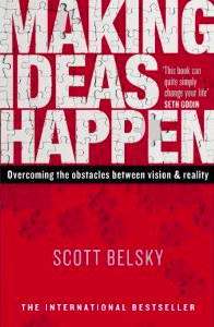
Just read the excellent ‘Making Ideas Happen: Overcoming the Obstacles Between Vision and Reality‘ by Scott Belsky, founder of the Behance network. You may know Behance from their excellent Action Method system and series of related notebooks, all of which – along with the book – are aimed towards helping people in creative industries be productive and get things done. Of course these days pretty much all of us work in creative industries if you’re not stuck in a McJob (in which case get out…).
As the book’s title suggests, Belsky wants to help you get the genius creative thought in your head out into the real world where it can either flourish or fail – but at least it will be real. To make this happen he’s gone round asking a number of successful people in the sphere of creative execution as to what they’ve done just to make stuff happen. The book distils this down into easy to understand sections backed up with good real-life examples.
Read the rest of this entry »


