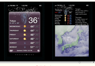
Edward Tufte, information design master, has released an insightful and educational video review of the iPhone on his website. It’s a large movie shot in clear, Apple style black background with Tufte talking through his observations as he goes. Delivered in calm, soothing tones are such wonderful phrases such as “To clarify, add detail” and “Clutter and overload are not an attribute of information, they are a failure of design”.
Tufte has a high regard for the iPhone’s high resolution (163dpi) screen as well as how Apple have removed “computer administrative debris” to ensure “the information is the interface” with direct interactions by humans on the content, not via buttons – or at least with transparent controls where necessary. Where he’s not so impressed is with the “strong colours and zebra stripes, but not much information” on the stocks page – suggesting that instead of the “cartoon/Excel resolution” Apple could employ their “image level resolution” to let people zoom in and out of complex, informative displays. Similarly for the weather page shown above.
Aside from these few suggestions for information design improvement Tufte seems to like the iPhone – to quote; “If the information is in chaos don’t start throwing out information, instead fix the design – and that is exactly what the iPhone has done.” Go watch the video and learn from a master.

Leave a Reply
You must be logged in to post a comment.