Yesterday I got my first chance to play with Apple’s new iPhone at their 5th Avenue Store. First impressions, it’s cute, feels great in the hand, has many genius ideas but some annoying niggles still came up even in a short time.
The first thing that strikes you is the quality and clarity of the display – the background is a really dark black, and the icons really pop out. The glass in front of the screen also feels very smooth and cool to the touch, and even with my greasy, sweaty fingers it didn’t seem to pick up any fingerprints – that alone is an amazing development that I wish all of my handheld devices had. The iPhone is a comfortable size in the hand, and surprisingly thing – akin to the latest generation of iPod but with rounded edges on the front.
Using the iPhone is relatively intuitive. The icons are obvious, bold & easily clickable – plus they have small text descriptions below to guide you. Though small, the text descriptions are incredibly clear and easy to read, another facet of the excellent display. There is a slight learning curve when you read a web page, using two fingers slide apart or together to either zoom in or out of the page, then using a single finger to drag the screen apart (as opposed to the MacBook’s two finger drag). Reading or viewing anything is aided by the in-built orientation sensor, that tells at what angle you have the screen and rotates the display accordingly, although in youTube mode it sensibly forces you into landscape orientation for best viewing. Yes, youTube is a front menu option, it’s just a shame that the download times are a little slow over the phone network, but not so slow that they are unusable.
Zooming in and out of web pages to read is not as easy as I’d thought it could be. My website rendered correctly, unsurprisingly given the Safari engine embedded in the iPhone, but having to zoom in/out to get posts to the correct scale to read was a bit frustrating. Once you’re at the best zoom level scrolling with your fingers is easy and fun. I wonder how many sites have already started iPhone optimisation looking at the iPhone’s user agent in the header?
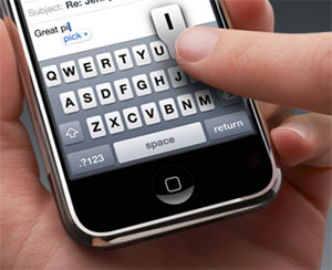
For entering text Apple has plumped for an onscreen keyboard, as opposed to the defunct Newton’s ‘written’ text. The keys are much smaller than the average finger tip, but Apple has developed a method that works out which key you meant to press by looking at the center of your finger. This works pretty well, except at the edges of the keypad. I found myself pressing ‘P’ instead of ‘O’ regularly. Like most touch keypads it is most likely something you learn to do better with time, but that initial usage was mildly frustrating. I wonder if offering a larger button keypad as well would help, time will tell.
There are many other interesting features to look through, I didn’t get a chance to make an actual phone call for example! Nice little touches such as a one click, highly visible airplane mode, are present all through the device. That said I’m not convinced enough to splash out $500 for the cheapest model, with only 4Gig of unexpandable (what!) memory and a lock in to an AT&T contract. Roll on iPhone v2 – I’m sure that will be even more perfect.
Footnote: Originally I had hoped to do this blog post from the iPhone, spelling mistakes and all, but for some reason I could not log into Blogger. I’m sure that was just something I’d have to work out, but given it also took me a good three minutes to even get my username & password entered it was a task left for another day.

Leave a Reply
You must be logged in to post a comment.