Posted: August 11th, 2007 | Author: Matt | Filed under: Graphic Design | Tags: Animation, Apple, Fun | No Comments »

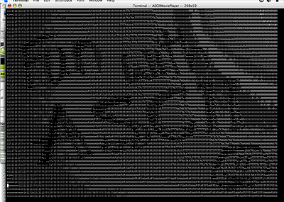
Thanks to a handy little XCode application, Mac users can now watch your movies in wonderful ASCII-Vision (TM). It’s not the most straightforward process unfortunately, so perhaps someone will add a filter to youTube sometime in the future. Till then follow these steps to create ASCII movie joy at home:
- You’ll need Apple’s development environment, XCode, to be installed first. You can get XCode here.
- Visit Apple’s Developer site to pick up the ASCII Code Demo.
- Deploy the package into a local folder, then open the Xcode project. You can now simply select the project and click ‘Build’ at the top of the pane. An executable will be created under <your project folder>/build/Development – assuming you don’t get any errors.
- Now find a demo movie – I found it worked well with .AVI files created from my Canon G7 – and put that in the same folder as the executable.
- Open a Terminal window, navigate to your folder then run: ./ASCIIMoviePlayer <your movie file> and you should see a movie running in the terminal window. You may need to adjust the size of your window to see it properly.
Have fun – and let me know if you create the next ASCII Star Wars. [From Dysturb.net]
Posted: June 6th, 2007 | Author: Matt | Filed under: Graphic Design | Tags: Designing for Disabilities, Graphic Design, Mistakes to Learn From, social networks | No Comments »
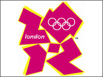
Well the London Olympic games may still be a few years away, but there’s plenty of controversy to keep everyone entertained in the meantime. Recently the British Olympic committee unveiled the new logo design to immediate, countrywide disdain. The logo cost £400,000 (~ US$800,000) and it’s amazing to see what you get for that money – I’m sure it paid for a lot of focus groups & surveys.

So now the BBC is asking people to send in their version of a logo – most of which are, frankly, awful – but some of which show promise and are more in keeping with common London design styles (translation: lots of Gill Sans). What amazes me is that, as a country, we didn’t take this change to have an open public competition to create a logo and vote for it. Think of the money you could raise for the Olympic fund running a premium text message vote for ‘Britain’s Next Top Logo’? Unknown British designers could submit their designs and win a top prize plus a place on the design team. It would have been perfect, but old school ‘money for the boys’ thinking reigned supreme – no wonder the Olympic budget keeps getting increased.
Now there’s another uproar; the presentation video developed, I can only assume for even more money, includes a section of flashing lights that has triggered epileptic fits in susceptible people. So our beloved Ken, the Mayor of London, has waded into the fray and demanded that the company responsible not be paid for this “catastrophic mistake”. My feeling on this is that it is a more honest mistake, and I’m sure that plenty of government people reviewed the video first so is it really the fault of the company developing it? Britain has pretty strict rules about limited sighted people being supported on websites, but I’ve never heard of anything regarding epilepsy.
It will be interesting to see how this pans out. I’m sure we’ll hear of more ‘mistakes’ such as these. I can only hope that as a country we don’t mess up by spending so much energy complaining about mistakes that we don’t have any left to make the games the success they should be.
Posted: January 12th, 2007 | Author: Matt | Filed under: Graphic Design | Tags: Graphic Design | No Comments »
Core77 posits that a designer backlash is upon us, as increasingly people are either overwhelmed by design choices that become ‘yet more landfill’, or become ‘designers’ themselves. Is Stark to blame or the savior of design?
Posted: January 10th, 2007 | Author: Matt | Filed under: Graphic Design | Tags: Graphic Design | No Comments »
Nicholas Felton, aka Feltron, has created the most wonderful report of his year: The Feltron 2006 Annual Report. In it, with great style, he documents his life around Manhattan including the four plants killed, ratio of social to alone dinners (1.15:1) and 2,721 photos taken (of which 5.8% were posted to flickr of which most are amazing American car logos).
Oh, and by a strange coincidence we were both at Daedelus’ APT gig back in July. It’s a small Interweb sometimes.

